Emails
If you want to build and create an Email Marketing Campaign, this can be done in the Marketing Channels section and Campaigns section. Subsequently, the created emails can be used for One Off campaigns (newsletters) or automations, which in the Releva system are called “Workflows”.
Creating email
In the left column, select the “Marketing channels” section and the “Emails” subsection.
Then click on “New Email”

Then you will have to name the email, as in the example:
On the first screen, set the campaign name (only visible in the Releva system), the email title “Subject” and a name to send it from( for example “Team of {your store name}).
In the “Preview Text” field, you can set the text to display when the customer sees the email in their inbox, before the message title field.
From the body section you can create the content of the email message, which is explained in details below.

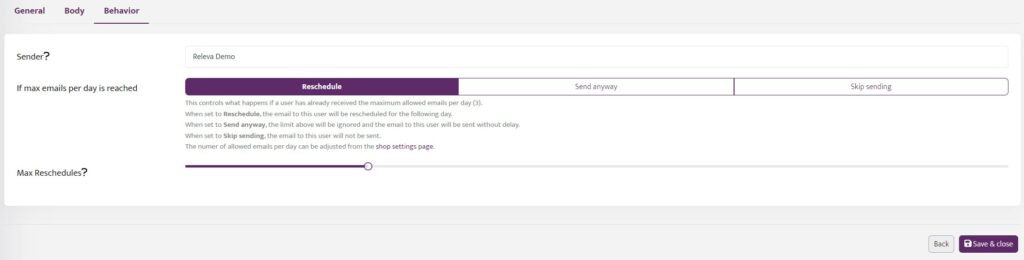
Finally in the behavior section you can set the sender name, which is seen in the email by the clients. You can also select what happens if a user has already received the maximum allowed emails per day (this setting is set in the Emails section of the Shop menu). The three options are to reschedule, send anyway or skip sending the email.
Keep in mind that you have to save any changes.
Creating the content of the email
As mentioned before the content of the email can be created and edited from the body section. It is controlled by the The Setting Panel which is located on the right side of the screen.
Settings Panel
It contains almost all the functionality of the embedded settings for editing email templates.
The Settings Panel is divided into 2 parts: the “Appearance” and the “Content” menu.
Appearance menu
All the styles that you set in the “Appearance” menu will apply to the entire email. How does it work? You set design styles for a certain element just once, and these design styles will apply to this element across the entire email no matter how many times you are gonna use it. And there will be no need to work on its design every time from scratch.
In the “Appearance” menu, you can get access to the following settings:
- General settings;
- Stripes;
- Headings;
- Buttons;
- Mobile Formatting.
General settings
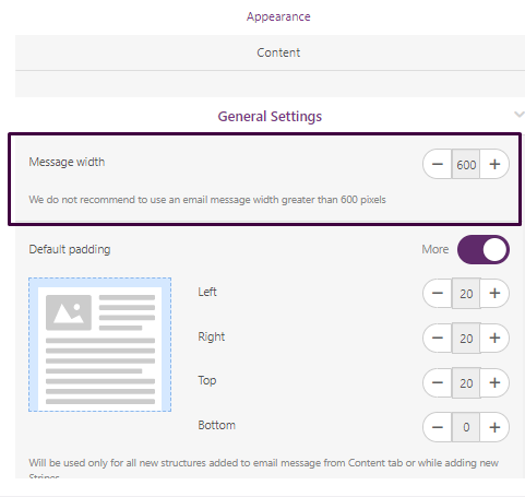
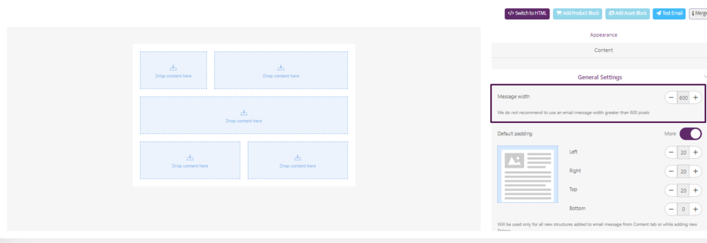
In this tab, you work on your email design styles: You customize email message width, default padding for structures, background color as well as image, font, line spacing, paragraph bottom space, underline links, RTL text direction, and responsive design.
By default, the message width is 600 pixels. Today, this is the most standard size among all email clients.
You can change it according to your preferences.
Default paddings stand for the fixed padding size for future structures that you add to your email message in the future. You can set separate padding for each side of the structure or remove them altogether.
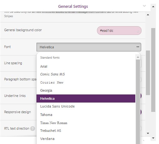
Fonts
The chosen font will be applied to all “Text” blocks in the email except for Headings. You can choose any standard or custom font from the list.
Line spacing is the distance between the text lines in text blocks. You use them to give your email a more formal or informal style — this is totally at your discretion.
The “Underline links” control helps you enable or disable links underlining for the entire email.
The “RTL text direction” option allows you to write texts from right to left. Meant for those who write emails in Arabic, Urdu, and other languages that use the RTL script.
Responsive design — this option is always ON by default.
If you turn this option OFF, your email on mobile devices will look just like it does on desktop devices.
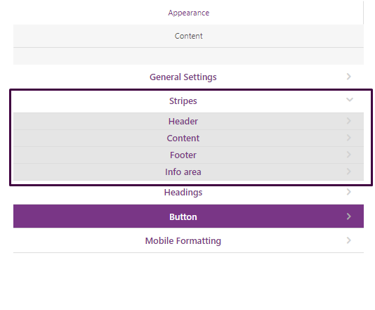
Stripes
Stripe is the email message area containing structures, containers, and basic blocks. Below, we will show you how to work with the stripes.
To add stripes, click the “+” icon at the bottom left corner of the stripe.
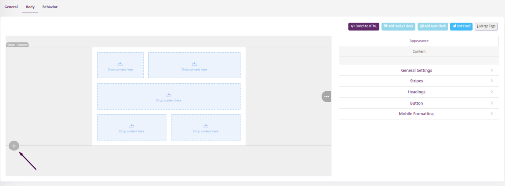
Every stripe has its type: Header, Content, Footer, Info area.
Using different types of stripes can be helpful for advanced adjustments.
You are able to:
- set individual font sizes for each stripe (it is especially necessary for the “Footer” stripe, where small fonts are more preferred);
- set the font and link colors;
- also, highlight the stripe and its content with a color. This is especially useful when you want to draw users’ attention to a certain email element;
- the “Background image” option is another way to help you customize the background. It is required when according to the corporate, there should be images in the background or backgrounds with a logo.
Headings
To apply headings to a certain piece of text, we need to highlight the latter and choose a necessary heading in the text formatting menu.
Then, in the Settings panel, you set the necessary font type, size, style, and color for the headings as well as line spacing.
Buttons
Buttons in emails are always a call to action. They invite users to go to the website, place an order, follow on social media, leave a comment, vote for the best product, etc.
The button menu allows you to set some default parameters that will be applied to all buttons in the email, so you can set:
- font size, font style, and color;
- button color;
- border-radius;
- the full content border, or do it separately for each side with an option to customize the border color;
- internal padding;
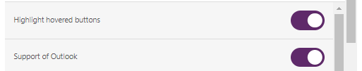
- activate the “Highlight hovered buttons” styles and set hovered colors. The button colors will change when you hover the mouse over it;
- “Support of Outlook” control allows improving buttons displaying in Outlook by inserting a special VML-code element.
Mobile formatting
Responsive email design comes as no surprise today, as we all know that mobile-friendliness, aka mobile optimization, is no longer just nice to have; it’s a must.
To make your emails fully legible across any device, you can apply font sizes to headings, to different stripes, to buttons, etc., that differ from the desktop version of your email. You can also work on internal paddings inside containers and hide/disable certain elements on mobile devices.
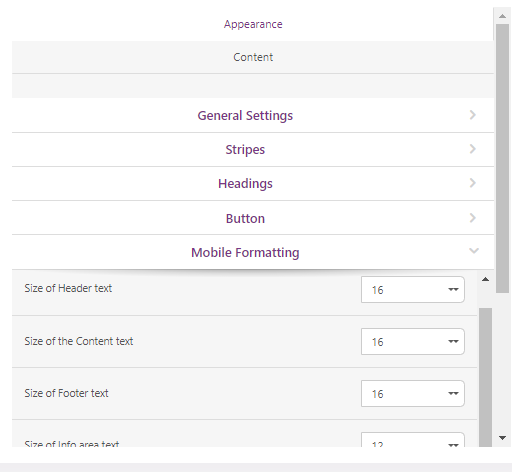
- apply font sizes to headings H1, H2, and H3 and to different stripes;
- set button text size. 18px or higher is the most optimal size here;
- enable the “Full-width buttons” option to fit the button on a user’s mobile screen.
All emails that you build with Stripo are responsive by default.
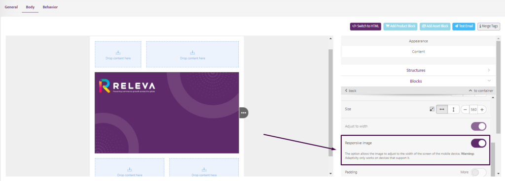
The option allows the image to adjust to the width of the mobile device’s screen.
Warning: Adaptivity only works on devices that support it.
However, you can disable the “Responsive image” design for some email elements.
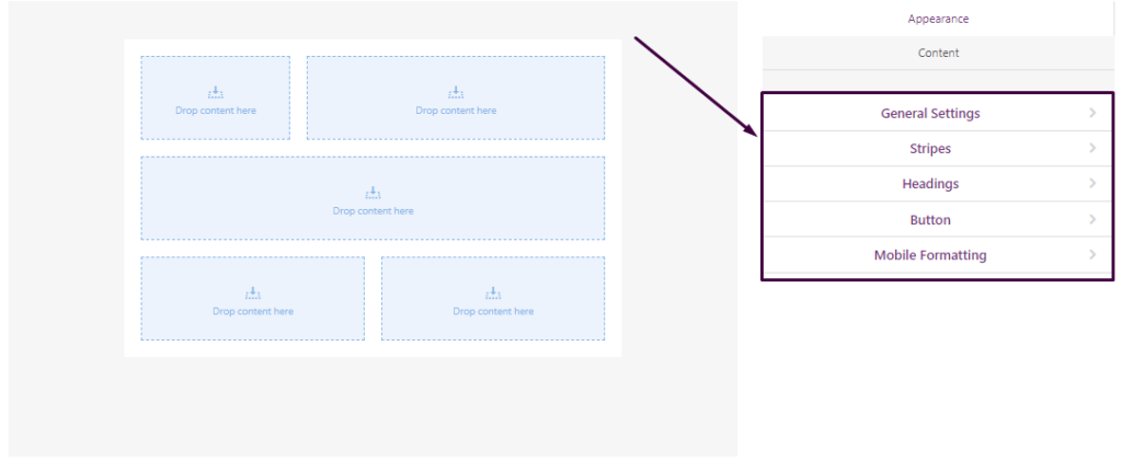
Structure menu
To add an extra structure, drag and drop it from the “Structure” menu to the desired position of your email template.
Like other email elements, structures can be saved as modules, moved, copied, and deleted with the help of the corresponding drop-down menu that appears by mouse hover.
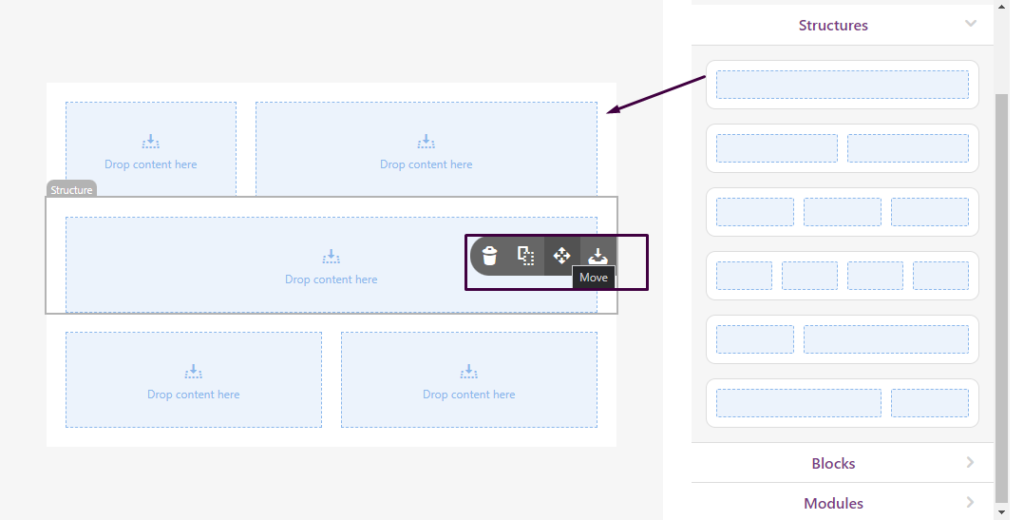
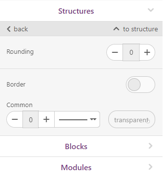
Structures adjustment
Structures settings are available when you click on the structure itself.
You can:
- set the background color of the structure;
- you can set padding for a structure for desktop and mobile view;
- configure the full content border, or do it separately for each side with an option to customize the border color;
- configure the structure’s responsiveness to locate their containers one below the other for mobile view or set inversion for responsive structures to display containers in reverse order on a mobile screen;
Containers
Containers are located horizontally in the structures. Each container can contain an unlimited number of blocks located vertically.
When you click on a container, you can:
- configure rounding for the container;
- configure the full content border here, or do it separately for each side with an option to customize the border color;
Block menu
Adding logo/image to an email template
There are three ways of doing it:
Dropping/uploading an image
Here, you can just drag and drop the image you are about to use for your campaign or upload it from your computer by clicking the “arrow” and selecting the very image from your computer.
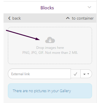
Please, be aware you can upload images in JPEG, GIF, and PNG formats with a maximum size of 2 Mb and an image resolution of 4000 х 4000 px.
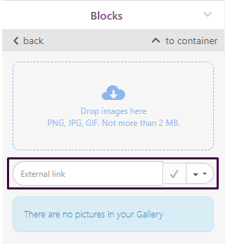
Pasting an external URL
If you do not have the banner image saved to your computer, you are welcome to insert a link to this image on the web.Paste the link to your image in the “External link” field.
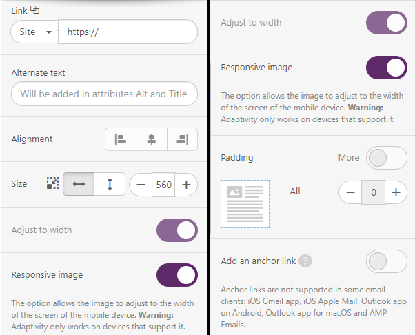
Additionally, working with the “Image” block, you can:
- insert a hyperlink that takes readers to your website;
- add alt text to the image;
- center alignment is set by default. If you need to change it, click “left” or “right” alignment. Also, you can set alignment for mobile by clicking on the Mobile icon;
- set the image size — my image’s width is 600 px;
- enable the “Responsive image” option;
- set padding for desktop and mobile view.
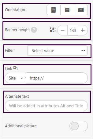
How to build an email banner with Stripo:
- drag the “Banner” block into a 1-column structure in your template;
- click on it to open the settings panel;
- add your main image;
- choose the orientation;
- use the “Banner height” control to set your own height of the banner cropping area;
- paste a link that will take recipients to the place related to the value offer described on the banner;
- enter alt text — this text will be shown to recipients if images for some reason cannot be displayed;
- choose filters;
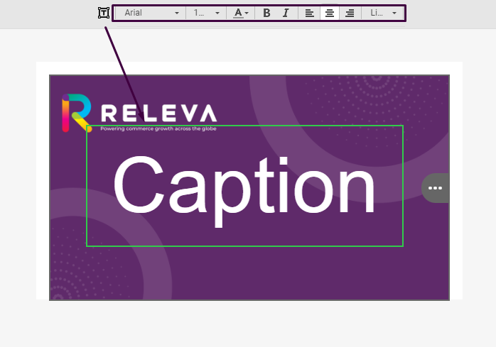
if you need to place any text over the banner image, click the “T” button on the settings panel above. Once it gets light, you need to left-click this image again;
- the very moment, you’ll see the “Caption” inscription on the banner;
- erase this inscription and enter your text here;
- set font size, font color, and font type;
- among the banner fonts, choose the one that fits your email best;
Adding a Video
The “Video” block allows you to create a beautiful thumbnail image for your video, which contains a link to the video itself and the video’s title.
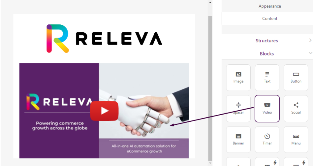
Thumbnail with a link to a video
- In order to create a thumbnail image for your video, simply add the block “Video” to an email. On the right panel, paste the link to your video in the field “Link to Video”:
It is important to notice that the video block supports only YouTube, Vimeo and TikTok videos.
- Done. Our editor will now generate a thumbnail image, add the link to the video, as well as the “Play button” and the video’s title.
The panel Video block allows you to customize the thumbnail’s appearance: you can add your own thumbnail image, change the Play button, change the title, etc.
Adding text
- drop the 1-column structure into your email template;
- drop a “Text” block into it, or click the “Text” icon right in this structure;
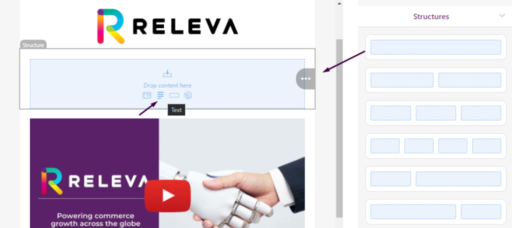
- enter your text;
- a block can contain both regular texts and headings. To apply a heading to a piece of text, you need to highlight it with the mouse pointer or triple-click on the entire text block, and then pick the format in the “top panel” tab at the beginning;
In the text formatting menu, which is located at the top of the page, you can work on the text styles, headings, paste links, increase/decrease Indent, add merge-tags, symbols, emojis, tables and bullet lists.
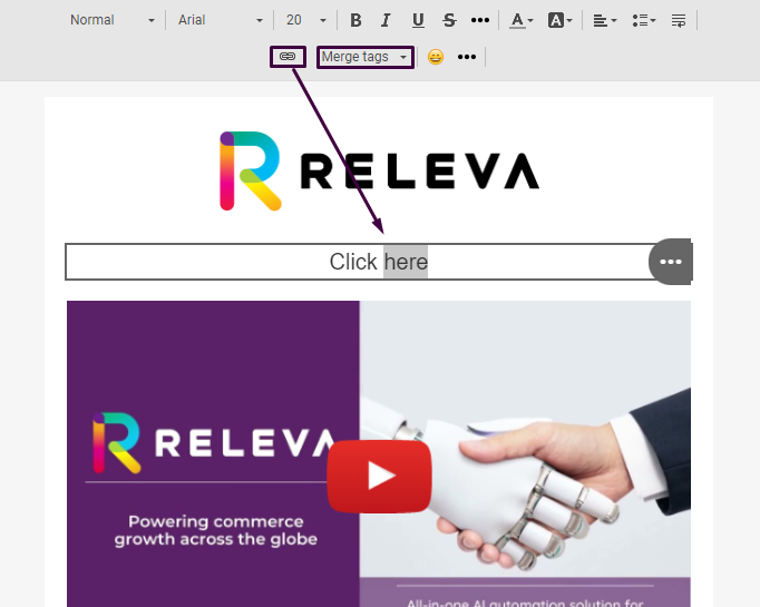
Adding links to text
To add a link to text, highlight the necessary word/text and click the label “Chain” in the top Settings panel.
Then, select the link type (protocol) that fits best in the left settings menu and insert its data.
Аdding merge tags (personalization tags)
The merge tag is a piece of code specific to an email service provider that allows you to insert unique user data from your mailing list into emails. You can add personalization tags (Merge tags), which allow you to add the name/surname/address and other customers’ personal data individually.Click on the text block and select desired Merge tag in the top settings panel;
Adding a button
The button is a very important element that affects your CTOR (click-to-open rate). Without a button, customers can’t buy from you or get registered with you.
- drop the basic “Button” block into your template and put it right next to the necessary element;
- click the “Button” block in the template to activate the Settings panel;
- insert a necessary URL link;
- enter your button text, aka button label;
- set text styles, including the font style and text size, and also set button and text colors as well as background color;
- add border-radius;
- apply the hover effect to the button if you like.
The “button color” stands for the primary color, highlighted button color stands for the color your users see when you move the mouse over it, and the text color stands for the font color.
You can activate the “Highlight hovered buttons” in the Appearance tab and edit the color in the Content tab (Buttton block);
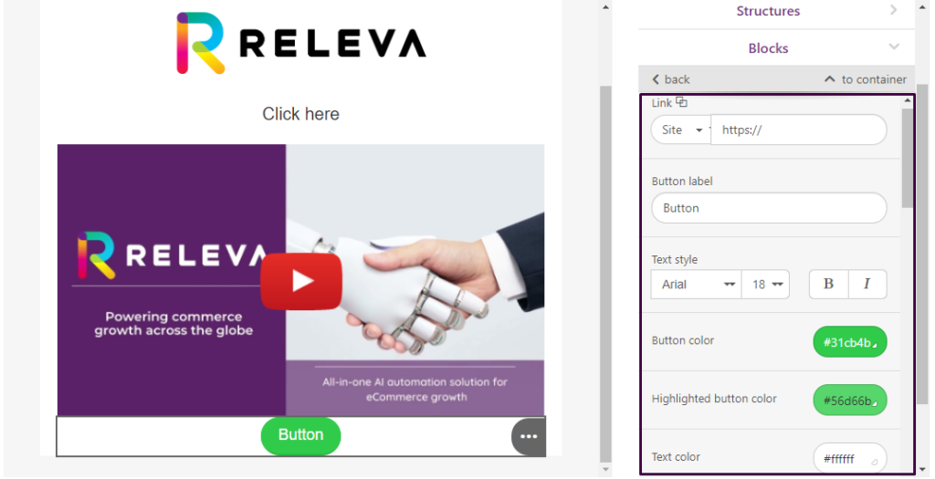
- adjust button to width;
- set the button border if you like;
- set internal paddings – they are responsible for the space inside your button.
- set external paddings – they are responsible for the whitespace outside the button, but within the container it is located in.
- also, you can add an icon to the button. The feature is not supported for Windows Outlook 2002, 2007, 2010, 2013, 2016, and 2019.
Spacer
The spacer is a decorative element that makes emails look orderly and enhances the content perception.
- drag a 1-column structure into your email template;
- pull the “Spacer” block in it;
- double-click it to open the settings panel;
- pick a color and choose a line style. It can be solid, dashed, or dotted;
- set width — the width here is measured in %, not in pixels!
- specify spacer alignment. By default, center alignment is set. If you like, please change it in the “alignment” section;
- toggle the “responsive spacer” button for a spacer to render properly on mobile devices;
- if necessary, set padding.
Social media icons
Quite often, we have social media icons with links in emails.
You can add them to your emails with the “Social” block:
- Drag the “Social” block into your email template;
- Pick a design style you like;
- Choose necessary icons;
- Paste your URLs;
- Double-click it in your template to activate the settings panel;
- By default, you will see 4 icons. If they are not enough, click the “plus” button to add extra icons to your email;
- In the settings panel, next to the social media icon, toggle the “more” button to start working with this particular social network;
- Insert respective URL links;
- Enter Title and Alt text;
- Set style for these icons and their size;
- Set the paddings, alignment, and indents between the icons.
Furthermore, you are able to add your own social icons. To do that, pick up the “Custom icons” type and upload your icons.
Menu block
The “Menu” block is used in the email header to quickly take users to a necessary page on your site.
Users can be redirected to a website or another element inside the email when they click on a menu tab.
- drag the “Menu” block into your template;
- add extra menu items if you like. By default, Stripo offers three of them;
- now in the settings panel, you need to choose whether to use icons, links, or both. “Icons” stand for the images in the menu; while “links” stand for the names of the menu tabs;
- once you select the menu type, you can set the color and font of your links in the “General settings” section;
- now you need to name each menu item;
- insert necessary URL links;
- do the same to all menu items;
- if you want to hide some elements for mobiles, just click the “Hide on mobile” icon.
Adding a product block
The “Product Block” is used to send a selection of products to your clients. Unlike other blocks it can be added to the email directly without putting it into a structure. In the email editor the product block is just a placeholder, however once sent to clients it will be filled with products.
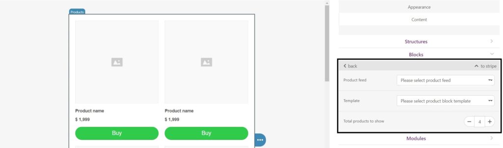
The product block has three key settings
- Product feed- you can select a specific product feed which dictates the rules behind the products that your clients will see
- Template- you need to select one of the available templates
- Total products to show – here you can decide how many products your clients will see in the block
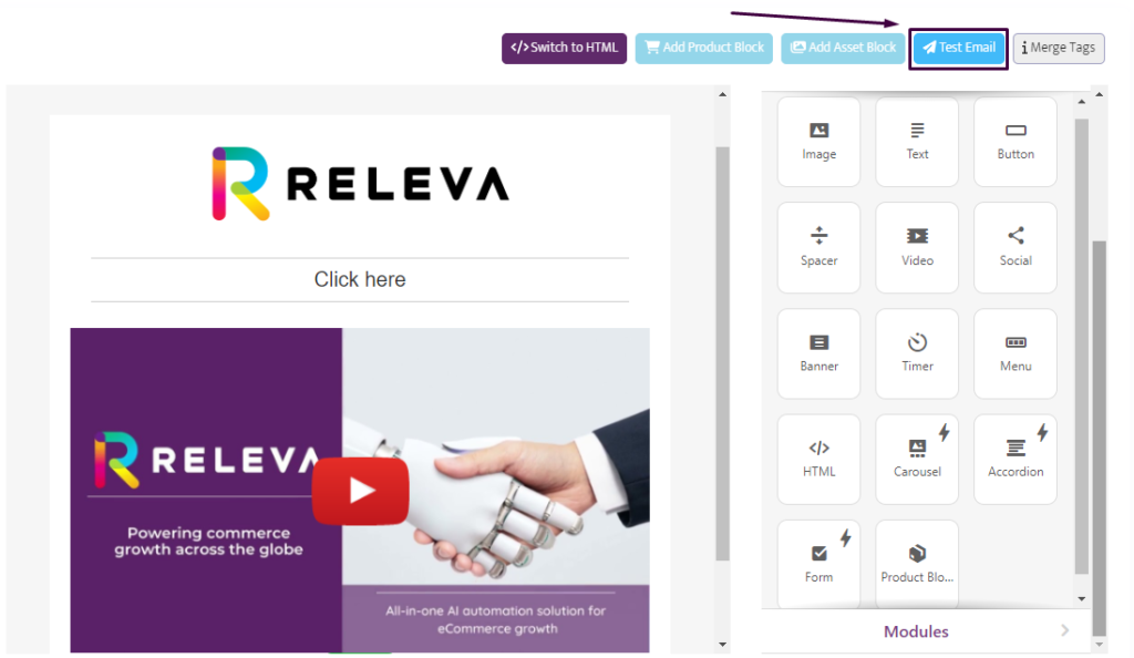
Test Email
To test your email click on the “Test Email” button.
Test Email Button – allows you to send yourself a test email by showing you how your email will be displayed in various systems.